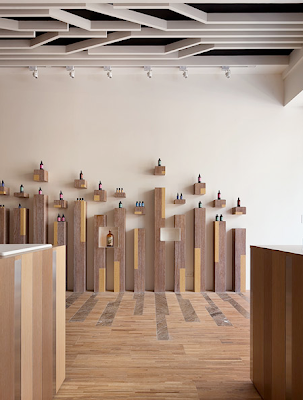
Here's a little about my concept:
The space is meant to embody a blank page - crisp, clean, pure, full of potential. The blank page is always polarised by the mind and the imagination - filthy by comparison, overflowing with sinful thoughts of unfulfilled debauchery.
Sin is a construct of our Western culture. It governs us, often literally. Conversely, sin is part of human nature: we feel jealous, we feel angry, we are self-loathing, we feel pride and lust. Fashion designers use this as a basis for an entire industry. It felt apt that a fashion designer would inhabit a space that uses human nature as a metaphor in building form.


During the day, the crisp purity of the courtyard is maintained by the blaring sun. As night falls, shadows emerge from the surrounding spaces, creeping over each other across the blank page. These spaces draw a metaphor for the human mind - always lingering on the sinful, the dark and the dirty. Perhaps not always acted upon.
The imagination is where sin begins - creativity is imagination. The workshop space is a textural and spatial embodiment of the mind's sin. Where imagination is reality. Where designs are kept, always tentative and unresolved. It is not until a design enters the blank page that it becomes an a reality for anyone but the designer. The blank page translates an idea into a form; able to be scrutinsed by others.
Fortunately for the designer, this space is an etch-a-sketch. It can be wiped clean of sin and imperfection upon critique, sent back to the mind for further thought.
" The unwritten work is always better than the written one."


With the pressure to impress, designers are constantly under the watchful eye of critics, the media and an unforgiving public. The need for an escape, for a release, to feel safe is always present.
"The most sophisticated people I know - inside they are all children."
- Jim Henson.
- Jim Henson.
The mezzanine space is exactly that: a 'treehouse' loft that allows the design to centre themselves with renewed perspective on work discarded and work to be done.
 The blank page is governed by a 'nude' structure that becomes more or less constricting depending on the designer's requirements: privacy or publicity, safety or exposure.


As usual, click any images to view.
Basically the project will be progressing from here into a more resolved space. I need to think about thresholds, occupation and vertical circulation. I'd really like some advice regarding what fashion designers require in a studio space and how designers like to work.
Let me know! I'd love some feedback.


